Dynamics 365 Fraud Protection
Project at a Glance
For a year at Microsoft, I served as the solo UX designer on a team that built a new enterprise-level commercial product, which leverages AI and machine learning to mitigate the cost of fraud in the e-commerce space. This meant designing every aspect of the UI and optimizing 14 different feature sets at the rate of more than one a month. For this project, I was the only designer on a team with 9 Product Managers, 8 developers, and more than 30 engineers and data scientists. This product is entering a $265 billion market, with public preview starting in April 2019 and general availability beginning in October.
Project Summary
This was the biggest project I had ever inherited. Before my tenure was a UX design contractor who had been creating rudimentary designs for 4 months. My first weeks required a massive ramp-up on existing assets and specs. From then on, I worked as the conduit between the PMs, who generated product specifications, and the front-end developers, who implemented my designs. I also had to liaise with back-end engineers and data scientists on a regular basis to ensure that the designs could be functionally supported and that the features we created would serve as useful and intuitive tools for our customers. Of all the projects I’ve worked on to this point, this has been by far the most illuminating. I learned a monumental volume about product design, cross-team collaboration, how to integrate big data with UX, as well as coming to understand the most effective strategies for my own design practice.
Ramp-Up
I only had two days overlap with the designer that preceded me. Dynamics 365 Fraud Protection is not a simple application, many magnitudes more complex than the websites and apps I had designed in the past and those first couple weeks were like drinking from a fire hose. But it was exciting! The feature specs created by the PMs were scattered about and written with jargon and acronyms that they considered common knowledge. Moreover, I had to quickly metabolize complicated issues like ROC curves and the underlying architecture of APIs and payload tags.
To navigate that first phase, I leaned on a few reference docs left to me by the designer before me. I resolved then that in my career, if I need to, I will always pass off a project as seamlessly and helpfully as possible. But I also began gathering my own resources, creating a reference browser with all the bookmarks of all the documents and assets I would need. I also began compiling a list of questions as I read the specs. By the time I first synced with the PMs, my list was more than 80 questions long. Some questions could be answered in ten seconds. Some questions, they didn’t know how to answer and became action items. That list of questions has been given to several other team members when they on-boarded.
It took me about two weeks to get fully up to speed. Because the designer hadn’t expected to leave, the mocks I started with were a jumbled mess. I quickly reorganized most of the Sketch files I had inherited, re-created some of the nested symbols, re-labeled all of the groups, and updated my libraries. After the initial blitzkrieg, I was ready to dig in.
Tools
Prior to my tenure, the designer had primarily been using Sketch, which was one of the tools with which I felt most comfortable. Once I had rebuilt a number of the templates, my output of new mocks rapidly increased. We used the Craft plugin to directly upload mocks and click-through flows to InVision, which was where the Devs and PMs looked for “visual specs,” which was how they thought of UX deliverables. But everyone had trouble finding pages, so I made a table of contents, created a clickable left nav for every page in Sketch prototyping, and labeled all pages with a numbering system that corresponded to the sitemap I kept updated. Everyone’s workflow got less frustrating.

Compiling mock flows in Sketch, which is often faster than my other tools like XD or Figma.

InVision after re-labeling. I’ve fallen out of love with InVision of late. Still, sometimes handy.
There were other tools I used, such as VisJS and ReChart for data visualizations, and trusty standbys like Adobe Color, Xtensio, UX Check, the aXe plugin for accessibility, and all Fabric libraries. By far, my favorite design tool is a whiteboard.
But as I explored deeper into the Microsoft design community, I found that most teams used Figma, which I hadn’t used before. I taught myself how to use it over a weekend and began migrating our assets over. It made for easier presentations, collaborations, commenting, and, as Dynamics Fraud Protection gets handed off to a full design team, our devs and PMs are already adept at using those tools.
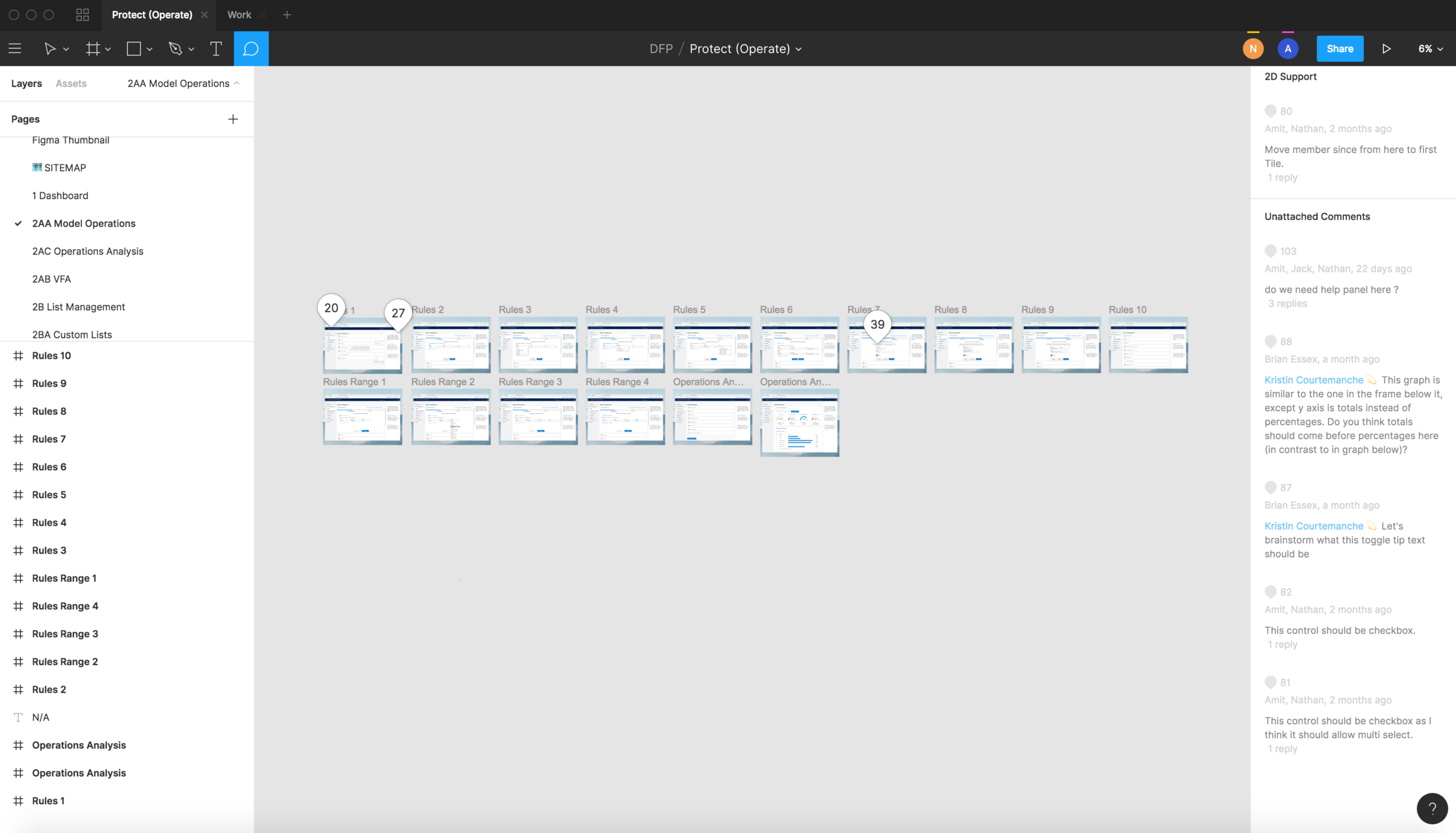
The way Figma manages commenting is magical. It just makes for such a straightforward punch list, and a really easy way to monitor what progress is being made and where.
Design Process
Each of my sprints began by meeting with one of the 9 PMs on my team. Each was responsible for a different feature, like Billing or Customer Support or Data Upload or Ontology Explorer. Typically, I found talking to them in person and white-boarding together was more effective than just reading the specs. I started each meeting by defining who was using the feature and what problem it was meant to solve. As I was the only person to create user personas and context scenarios, I sometimes had to push the PMs to imagine the actual person using the product. These sessions typically ended with a very rudimentary drawing of a particular flow. Then I whiteboard on my own and then iterate toward higher and higher resolution in Sketch or Figma, checking in with the PM along the way.
Running the project like a startup, the pace was blistering. I generally created 40 - 60 mocks per week (many of which were not ultimately used) and often had five or six of these features in progress at a time.
Once the PM felt comfortable with the shape of the mocks, I would meet with the dev team, sharing new screens with them at least once a week. It was advantageous to be in such direct and regular contact with the developers assigned to build my designs. They often made suggestions and critiques from a functionality standpoint, possibly pointing out that an element would be expensive to build or that Office Fabric couldn’t support certain aspects of the mock. I would then take this input back to the PM and negotiate a solution. I did a lot of this back-and-forth and a sizable part of my job was as an expeditor between the Devs and PMs.
A big undertaking was when this product, then with a different name, was switched from one application group to another. This meant redesigning every single page to align with Dynamics templates and design standards. The left and global nav bars had to be redesigned, all the icons switched out, colors updated, and components replaced. the Another major project involved defining rules for responsive page behaviors. Some of that behavior was dictated by Fabric/Python library but if it wasn’t accounted for in the mocks, the difference between 720px and 1440px could be extreme.
I’m very proud of the immense progress we made over the last year. Dynamics 365 Fraud Protection, originally called RaaS, went from a vague scribble to a useful and useable application. Here are a few examples of the transformation.

The Graph Explorer feature when I started.

The Graph Explorer now. Note the difference between the nav bars.

Customer Support in its earliest stage.

Data Upload in its earliest stages.

Customer Support final design with a collapsed nav bar.

Data Upload now.
And it was equally exciting to see a design go from “back-of-the-napkin” sketch to a fully realized element of the product. For example, here’s a peek at the transformation of Virtual Fraud Analyst from an idea to high-resolution.
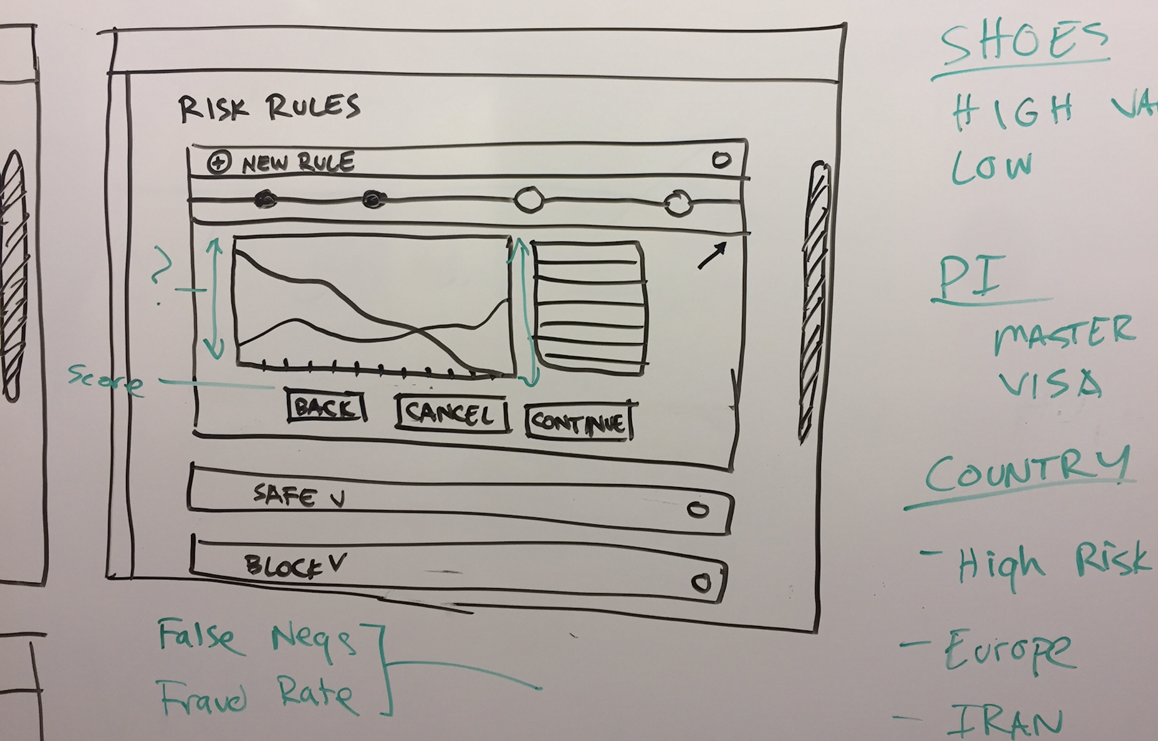
The first whiteboard concept of what eventually became Virtual Fraud Analyst.

Virtual Fraud Analyst final design.
Challenges
The biggest challenge was that there was little to no user research or user testing available. This was entirely antithetical to UX design as I practiced it, even in freelance work for tiny startups. Microsoft had built an amazing internal fraud mitigation tool and wanted to sell it to other companies. But too often, they assumed that what was good internally was what would be good for other businesses and users. Without user testing, much of the feedback on designs was opinion-based, often guesses not founded on verifiable data.
Another huge challenge was that I was the only designer (definitely in our building and possibly on our whole campus). This meant that the only feedback I was getting during syncs was from PMs and Developers, which was great but those disciplines speak different languages than UX and have different priorities. Without a team, I had to audit my own designs, which was not ideal. I had no one to learn from and learn with, and collaboration is one of my favorite aspects of work and a strength of mine. As a heavily tented project, during most of my time, I was unable to even talk to other designers at Microsoft. This also meant frequent frustration as Devs pushed for function and PMs pushed for more features and the holistic experience of the user was often lost in the noise.
Lastly, the sheer speed at which this product was scheduled to get to market meant that each feature was somewhat rushed. “We can fix it later after we get it out” was an oft repeated refrain. I could have spent many months crafting any one of the features but had to push out 14 of them in a super aggressive schedule. Luckily, the full Dynamics design team will be brought in to replace me and Jonah Sterling, the General Manager of Design for Dynamics, has wholeheartedly proposed robust and swift fixes to all of these problems. I just wish I could have worked with that team and learned from them, that I didn’t have to do this project almost entirely alone.
Product Launch
Public preview for Dynamics 365 Fraud Protection began in early April and beta will last until October 2019, when it becomes generally available. In all likelihood, DFP will become one of the tentpole applications of the Dynamics 365 suite. And while I wouldn’t recommend theirs as the optimal product design process, it gave me the opportunity to design the whole thing, which seems otherworldly. What DFP does, what it offers, what it can solve is genuinely remarkable and I’ve grown deeply attached to this product. I’m extremely curious and excited to see how the design evolves with the input of an entire design team over the next few months before the full release of the product.
I’ll very much miss my colleagues here who have been so kind and generous. But working alongside their fierce intelligence has easily been one of the most illuminating experiences of my career and it was an honor to get to work with them on such a massive and exciting product. I can’t wait for what’s next.