Taylor & Tapper
Project at a Glance:
This project was a top-to-bottom site redesign for a law firm. All work was conducted by me over the course of 3.5 weeks. Tools used include Sketch, SquareSpace, Invision, Xtensio, Adobe Color CC, Google Drive, Google Sheets, Google Surveys, and Quicktime. Skills used include planning, content audit, competitive analysis, site mapping, client interview, user surveys, user interviews, affinity diagramming, concept mapping, creating user personas and a user journey, hand-sketching, wireframing, user testing, graphic design, color theory, photo editing, mobile first design, CSS fixes, and domain migration.
Client Testimonial
"I needed to update my firm’s website to make it mobile compliant and ensure that it was doing all it could for my business. I got in contact with Mr. Langston and he was amazing. He talked with me and my partner to find out what we wanted, surveyed potential clients to see what they were looking for and talked with former clients to get a sense of what they liked about our firm. He put all these elements together into an attractive site that highlighted our business. As a result of his work, we found out things about our client base we did not know before and that have made a big improvement in our online presence. I would highly recommend Mr. Langston to anyone looking for a website, or a re-design."
- Clinton Tapper, Taylor & Tapper Attorneys
Project Summary
After graduating from General Assembly, I had trouble finding a position due to lack of UX experience, which is a chicken-and-egg problem. Following the advice of a designer at Amazon, I went looking for a freelance client in order to fully document my process and present a real-world product. To that end, I was engaged by Taylor & Tapper Attorneys, a small law firm in Eugene, Oregon that specializes in representing clients in dispute with insurance companies.
Taylor & Tapper's site was an outdated product created on the WordPress platform. The messaging was unfocused on the needs of the user, there were lots of stock images, dead-end pages with little content, and significant IA issues. The primary conversion sought by the firm was phone calls from potential clients but the site took a scattershot approach to converting users.
On this page, I'll walk you through my process, step by step, explaining my thinking, techniques, challenges, and iterations. I'll provide images, documentation, and work ephemera to illustrate how I got from the first stages to the finished product.
As this is a long document, you can click on each content title to skip to that section.
Planning
The first step was planning the project and presenting that to the client in a thoroughly thought out SOW. I followed the basic process template taught in General Assembly's User Experience Design immersive, which consists of five stages: Discovery, Research, Analysis, Design, and Implementation. Then, following the plan laid out in the SOW, I created a shared Google folder to share work materials the client as they were being generated, as well as a detailed calendar using a Google Excel sheet, to create transparency regarding what step I was on, when items were due, and overall progress. Ultimately, this tool was probably more useful to me than to the client, although it was nice to give them visibility into the work.
Discovery
My first step was a content audit. This consisted of looking closely at every single page, clicking on every single link, and taking notes on everything I saw. Some notes were questions that I wanted to follow up on or test, some notes were criticisms, some were simply observations. The important aspect was to get a comprehensive understanding of the existing site in order to understand how it might be improved.
You can click HERE to view my content audit and get a sense of what the site looked like before the project.
The next step was a competitive (or comparative) analysis. I subsequently found out that, because there are so few firms in Oregon representing clients in dispute with insurance companies, they aren't really direct competitors in the way companies in other industries might be. They exist more as colleagues in a small, specialized club. Still, it was helpful to look at the sites of firms offering similar services to see what they did better, what they did worse, and how Taylor & Tapper might differentiate itself for a user who was shopping around.
You can click HERE to read my competitive analysis and get a sense of market space for similar law firms.
Next, I knocked out a quick sketch of the existing site map to get a sense of the architecture from a bird-eye view. Though it was a very simple map, there were problems with how the content was laid out. Part of the reason it was simple was that this site wasn't a retail site with copious amounts of product pages and, because it was only seeking a single conversion, phone calls, didn't necessitate a bunch of functionality. The entire site was essentially an interactive business card.
Lastly, I conducted industry research to better understand current strategies for communicating with and converting potential clients. In retrospect, this work was only mildly informative to the project. Most sites regarding best practices in the business of law seem to be sales pitches for various paid-platforms and B2B services.
Research
The first part of the research stage was conducting a client interview. I recorded an interview with the client that lasted about two and a half hours. Interestingly, the client wanted to talk mostly about the practice of law, while what I most wanted to know about the experience of users. What kinds of questions did they ask during an initial meeting? What were they most scared or stressed about? What did they want to know about payment structures? What were the most common problems they were having with their insurance company? And so on.
This was a highly beneficial exercise and helped me zero in on user needs from the business side. The company's primary conversion remained the same, they wanted the phone ringing with more possible clients. Understanding how they would approach facilitating a call helped me understand how best the site should facilitate a first impression.
The second step of research was to compile a set of quantitative data. I used Google Surveys because it's free.
Of all the aspects of this redesign project, this is the one I'd most like to re-do. Some of the information collected was valuable, including racial, income, and age demographics. But some of the questions I asked were too vague. For example, I asked how much respondents paid a month for insurance, without specifying if I meant Home Insurance, Car Insurance, Life Insurance, Health Insurance, etc. Also, because respondents for this survey were collected via email invites and social media, we mostly got responses from people that were similar to us (our friends and friends of friends) and so the respondents were overwhelmingly white, in their 30's, and with similar income. While this was certainly one of the primary demographics the firm was seeking to capture, I knew from the client interview that many of their customers were minorities with lower income, which makes sense as Insurance Companies have a history of disputing claims from vulnerable populations.
The most valuable response was learning how few attorneys users interviewed before making a decision. The great likelihood is that users will hire the first, second, or third attorney they talk to. There's very little shopping around. When, for whatever reason, a user reaches out to an attorney, chances are very high that they will hire that firm, meaning that the conversion metric is solid.
You can read my analysis of those survey results HERE.
Next on the list was user interviews, the qualitative analysis at the very heart of the project. Even if the Google Surveys returned mixed results, it served a purpose in soliciting possible interviewees. Ultimately, I arranged and conducted 15 recorded interviews. I started with demographic information and quickly moved to open-ended questions, looking for common themes. Each interview was scheduled for 15 minutes, but if a respondent answered everything in 7 minutes, I'd let them go, and if they wanted to talk for 25 minutes, I let them take the lead.
I wrote a script to have on hand and attempted to ask every question in order but, if a respondent went in a different direction, I followed, curious as to where their experience led.
While I'm not allowed to publish the interviews, it may be helpful to read the interview sketch I wrote for myself as a way of understanding what I wanted to discover. You can read it HERE.
Analysis
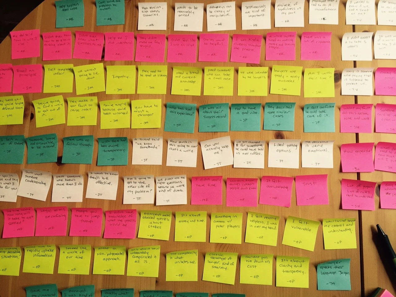
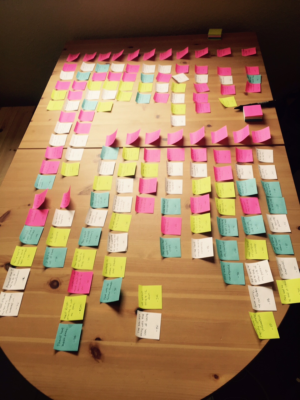
After the content audit, the comparative analysis, the site map overview, the client interviews, the Google Surveys, and the user interviews, I had a good understanding of the space and hours and hours of unpacked data. Some of the techniques I learned at GA seemed dumb to me, requiring too much work for too little return. But I definitely drank the Kool-Aide when it came to Affinity Diagrams. Distilling user responses to their most simplified root, grouping them spatially, and finding themes amongst disparate respondents seems highly effective.
Here are a few pictures of my affinity diagrams, both unsorted and sorted, which I did on my kitchen table (I prefer whiteboards).
The next project was enacting another technique that I originally found amorphous but turned out to be helpful. I created "I" Statements, essentially giving first-person voice to a group of affinity tags. I love what my mind is doing while grouping and mixing and regrouping these affinity tags. I'm reading each of the statements out loud over and over, almost like a mantra, until total sum of the user interviews is properly drilled into my brain. This trick gives voice to the user. and begins to make the user feel as real as me.
Click HERE to read the "I" Statements. This product is fascinating and directly relatable to actual interviews and data and specifically informed design.
After this, I did a Concept Map. When I learned this in middle school, they presciently called it "Idea Clouds," but in practice, I found it only mildly informative. Perhaps, it helped me understand the important hubs of what would be the site map. I would probably only use it in the future if I felt stuck with Information Architecture problems. At the very least, it helped me start codifying what we should be answering in the FAQ section.
Next, I crafted a mission statement, based on the client interview and the concept of the Golden Circle by Simon Simek. This was another thing I thought was wishy-washy business philosophy at first. But the more you think about it, the more it rings true. The most compelling aspect of a businesses' activities is why they do it, then, how they do it, and then what they do. Here's what I wrote for Taylor & Tapper:
"Helping people navigate turbulent situations is why we became attorneys. We even the playing field with insurance companies by empowering our clients, providing straightforward options, and tirelessly advocating on their behalf. We are an experienced, effective firm specializing in insurance law and serving clients throughout Oregon and Washington."
Taking the "I" Statements and the affinity tags, I used Xtensio to create a user persona - in this case, a married couple named Sarah & Tim Harrison. Many of the words and statements made by Sarah & Tim were taken directly from the user interviews.
I have mixed feelings about User Personas. I think it's helpful to write as a user in the first person voice. But as I make choices in how to define the persona, I can't help thinking about all of the personas I'm un-writing. I also need to do a better job of constantly referring back to the persona during the design phase. Perhaps it's because I need to do a deeper dive when creating personas but sadly, after the analysis stage, these tend to fall off my radar. That said, it's not something that I'll give up on but I don't think I've found a way to do it that resonates with my work.
I feel somewhat similarly about User Journeys, but it's helpful to get into the head of a user over a longer time period.
Design
This phase is the most fun for me and so I have to force myself to go slowly and methodically through Discovery, Research, and Analysis. But once I had a solid understanding of real user and business needs, I was ready to start envisioning the new site. I began by using the concept map, content audit, and competitive analysis to create a new site map. I started this by doing card sorting on my own but, as the site is pretty simple, it didn't take long to arrive at a structure that made sense.
There are a number of differences between this site map and the old one, as well as between this site map and the final project.
Firstly, I nested the Practice Areas under About, rather than give it it's own Navigation tab. It was the longest section of the old site map but could be easily distilled into a couple paragraphs. It was important to not be overly specific, which might discourage edge cases.
I also gave each person on staff their own page, as I heard from Users how important it was to know and like and trust the people in the firm. The site needed a human face.
The "Success Stories" tab was stolen from what I saw on a couple other sites during the Competitive Analysis, and was asked for during the User Interviews. One interviewee said, "I need to know that they can help me get to the other side of my problem." It's important that the user can envision a successful outcome.
I kept the FAQ section but the old site answered questions that wouldn't have been frequently asked by potential clients with no experience of the law. Essentially, they were just definitions of legal terms. Ultimately, I settled on six questions, lifted directly from user research. 1. What types of cases do you take? 2. How much does it cost? 3. How long does it take? 4. What are the odds I'll win? 5. How does the process work? 6. Why is my insurance company fighting me? This last section provided an opportunity to talk about how awful insurance companies can be, making Taylor & Tapper seem heroic by pitting them against what is commonly perceived to be an unscrupulous industry.
Even though I didn't get much evidence of its utility from research, the client wanted to keep the Journal (blog) section. An argument could be made that it could help SEO. One change I made was to turn of the publication dates so that if there were to be a long break between posts, it wouldn't seem like an empty or abandoned page to visitors. Currently, this section is turned off to the public because the client hasn't provided content due to getting incredibly busy with litigation. Once that material is provided, I'll turn the journal section on.
Lastly, I put the contact form only in Contact Us, rather than in a side banner on every page as it existed on the old site. Part of this was to avoid a user clicking on "Contact Us" and seeing a contact form right next to another contact form. That said, this is the only important conversion point on the site and so "Contact Us" buttons are on almost every page of the site, funneling users to this form from anywhere on the map.
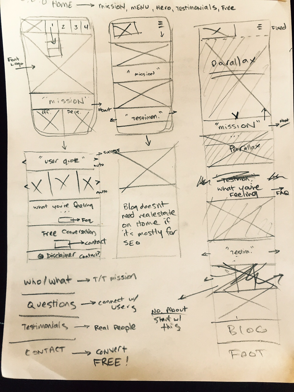
Next came one of my favorite parts of the process, hand-sketching pages.
Sadly, most of my raw sketch work was done on white boards, which were erased before I could take pictures of them. Nonetheless, you can see that from the start I was designing with mobile-first in mind, especially because Taylor & Tapper's old website was unresponsive. Designing with limited real-estate in a single column format forces decisions about messaging priority early on. There's also a number of elements from these sketches that made it through to the final product.
This process helped me decide that the blog didn't deserve real-estate on the homepage. I decided that I wanted to incorporate parallax to give the site a feeling of depth. I knew from user interviews that it was very important to prominently forefront that the initial phone call is free and without risk in the Contact Us messaging. I also knew from user feedback that there were two main qualities that they wanted in an attorney: 1. To be effective and professional and 2. To be personable and empathetic. To that end, I wanted, as much as possible, to oscillate back and forth between images of the lawyers looking serious and, for lack of a better word, "lawyerly," and images of them looking like an inviting and approachable family. This also helped differentiate Taylor & Tapper, a small firm, from other big and faceless firms in Oregon.
Next, I began creating wireframes of each of the pages. These were built using Sketch on an iPhone 7 art-board. Because the site was so simple and didn't require a ton of tricky functionality, I decided to build it on a SquareSpace platform so that the client could avoid the cost of hiring a developer. This meant that the wireframes didn't have to be pixel-perfect and I could skip the step of creating a high-def mockup. Had I been working with a developer, I would have built these to be pixel-perfect and specified the margins and ems for each element.
Once I had finished these mobile wireframes, I uploaded them into Invision so that I could user test the intuitiveness of the site (using my wife and three friends as test subjects) and then walk through the basic page designs with the client. Generally, my main two questions when user testing are 1) Here is information you are looking for. Can you show me how to find it? And 2) Here is a button or tab. What do you expect you will see or what will happen if you push it?
You can view the wireframe prototype on Invision by clicking HERE.
After the wireframes were in place, I switched gears and began thinking aesthetically. Graphic Design is an area where I haven't had a depth of experience but I'm finding it to be one of the most enjoyable aspects of the process. First, I played around with a number of SquareSpace templates and settled on Mercer. As I was going to be building the pages from a blank format, I mostly just needed to know that the Logo, Top Nav, and Footer matched what I wanted. I also felt that parallax scrolling ratio created the amount of depth I wanted. Using a test page and the Styling Editor, I made sure the margins, padding, font sizes, indents, icons, spacing, colors, mobile menu, and button shapes were correct.
In regard to font, I started experimenting with serifs, thinking it would look lawyer-ish but ultimately decided on a sans-serif because of it's easy online legibility. Moreover, given the client's target demographic, I wanted the overall aesthetic to look modern, young, and slightly hip.
In terms of color, I started by eye-dropping a series of colors in three groups, highlight colors, brown colors, and greyscale, noting the Hex codes so as to easily refer back later.
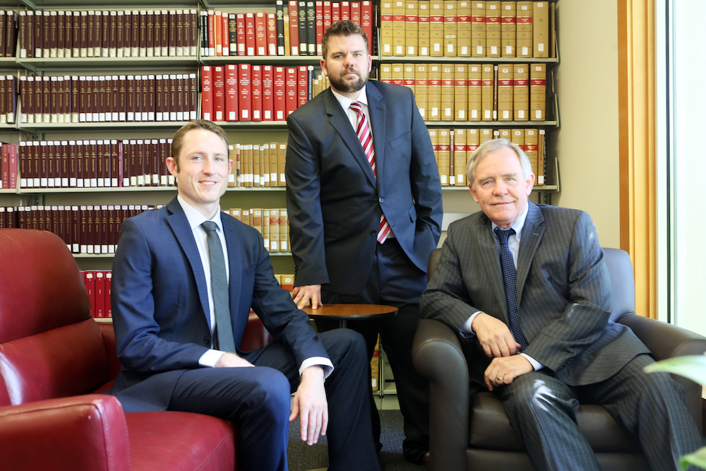
Color theory is not yet a strong suit of mine and something I'm working to improve. I knew that we needed new photos for the site, as the previous photos were poorly lit and poorly composed, and often relied on stock images. I was lucky enough to get the help of my friend Thomas Patterson who often shoots for the New York Times. Tom has so much visual experience and such a good eye that I decided to provide him with a shot list of pictures I knew we needed and an image board to give a feeling of the mood I wanted to shoot for. They're so corny that I hesitate to share them but again, according to user interviews I knew that we needed pictures that showed the lawyers as 1. Effective and Professional and 2. Personable and Approachable.
EFFECTIVE AND PROFESSIONAL
PERSONABLE AND APPROACHABLE
Tom sent me a folder that contained more that 1500 photographs and, while it took forever to download and sort through them all, they were pretty much exactly what I was hoping for. They were warm enough and colorful enough that I decided I didn't need to add any colors of my own. We actually organized a barbecue to get the "personable" shots we needed. Here are two examples:
EFFECTIVE AND PROFESSIONAL
PERSONABLE AND APPROACHABLE
I also decided at this point that, both because it would save page real estate and because it looked attractive, I would create the section titles in Sketch, giving each of the elements an 80% opacity so users could still see the parallax images beneath.
Implementation
A mistake on my part was not lining up our photographer first thing. Matching up schedules took forever and so images were actually the last thing to be added to the site. In the meantime, I made up some colored square PNG placeholders of various sizes - ones that were 1/4, 1/2, and 2/3 (by both height and width) the screen sizes of iPhones and HD desktop.
I'm fairly ambivalent about SquareSpace, Wix, and other bootstrap sites. On the one hand, they're cheap, relatively straight-forward, and allow clients that don't require complicated functionality to circumvent the cost of a talented dev. On the other hand, no bootstrap can substitute for a good developer. The templates impose formatting rules, smart cropping, and other standardization quirks which have unintended consequences. I imported the placeholders I had made and used them to experiment on how parallax rules were imposed, how slideshows worked, and so on so that when I finally had the photos, I could plug them in with minimal friction.
Next, I met with the client to edit some of the copy and trade out a few of the images. Certain phrasing of what had written wasn't quite in compliance with Washington State regulations on how lawyers can describe their services but it was easy to fix.
Lastly, I had to migrate the GoDaddy domain from the old site to the new one and activate it.


