Retrofit Home
Project at a Glance:
One of my early projects in General Assembly's UXDI program was to redesign the site for a Capitol Hill retailer called Retrofit Home. The project was time-boxed as a one week solo sprint and the goal was to create an interactive desktop wireframe that allowed for online retail. Tools used included Sketch, Axure, Google Surveys, and Xtensio. Skills used included user research, discovery, user journey, affinity diagramming, personas, information architecture, hand sketching, wire framing, and stakeholder presentation.
Project Summary:
Retrofit Home is a marvelous, funky home decor shop on Capitol Hill, which was vastly underserved by its website. The highly eclectic inventory was not viewable online, which made online retail an impossibility. The site, which was also badly outdated, didn't forefront the uniqueness of the brand. The goal of this project, the second in my General Assembly User Experience Design Immersive, was to design new IA for Retrofit and create low-definition, navigable wireframes. One of the primary conceptual problems I was working through was how a retail site could create a sensical, intuitive navigation and site maps, while generating the pleasing surprise of discovering an unexpected product, which is part of the fun of decor shopping.
In New York, I had extensive experience working in online retail. At Gilt Groupe, I worked in both Customer Service and Logistics. At One Kings Lane, started as a Merchandising Operations Specialist, and then moved to Analytics. And in all that time, I was constantly aware of what retail sites did wrong and the problems caused for customers and employees due to design problems. But I had never actually thought about how I would design one differently. As this project only lasted one week, I wasn't able to get as deep as I wanted but the process was still illuminating.
You can click on any of the items in Contents to jump to that section.
1. Research
After visiting the store in person and conducting a Google Survey screener, I selected 13 individuals to interview over the phone. The interviews, which typically lasted about 30 minutes, began with demographic information, moved on to collecting analytic data, and finished with more open-ended qualitative questions. In this way, they were able to "warm up," and by the end of the interview I was always amazed by how much users had to say about furniture and online shopping.
Among the 6 males and 7 females I interviewed, the average age was 39 years old. The average respondent made 3 online purchases a month and “window shopped” online an average of 3 hours each week. The most expensive piece of furniture they had purchased averaged out to $1,542 and the most expensive online purchase was $3,688. Often, this was a plane ticket. Rating the importance of seeing customer reviews between one in ten, the average respondent rated it at 6.77.

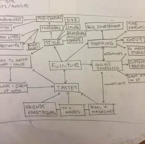
2. Analysis
Respondents viewed furniture shopping as an ordeal. It's expensive, consumers have to live with decisions for a long time, and pushy salespeople make the experience miserable. That said, online shopping for furniture wasn't popular, partly because of the expense and partly because the importance of touching, sitting on, or physically handling the actual object. Most respondents used "online shopping," as a way to window shop, using the internet to narrow the places they would need to visit physically.
The decor tastes of many of the respondents were influenced by visiting interior design blogs like Apartment Therapy, but most said they were influence by seeing things at restaurants and bars and at friends’ houses. They also paid attention to design that they saw in magazines, TV, movies and other entertainment media. When asked to consider their favorite pieces of furniture, a sense of nostalgia topped the list, followed by flexible functionality such as a couch with drawers or shelving that could work as a bookshelf or a TV stand.
Throughout the interviews, IKEA came up in almost every conversation despite the fact that IKEA was never mentioned in the questions or prompts. The feedback regarding IKEA was almost universally negative. Users said that it was shoddily constructed, not unique, disposable, and “the McDonald’s of furniture.” The experience of actually going to IKEA was equally awful. One respondent said that she categorically refused to shop there.

In general, the best thing about shopping in vintage stores for users was the "score" moment when they discovered something that they had never expected to find - they were surprised by the product and thus felt more connected to it.
3. Persona
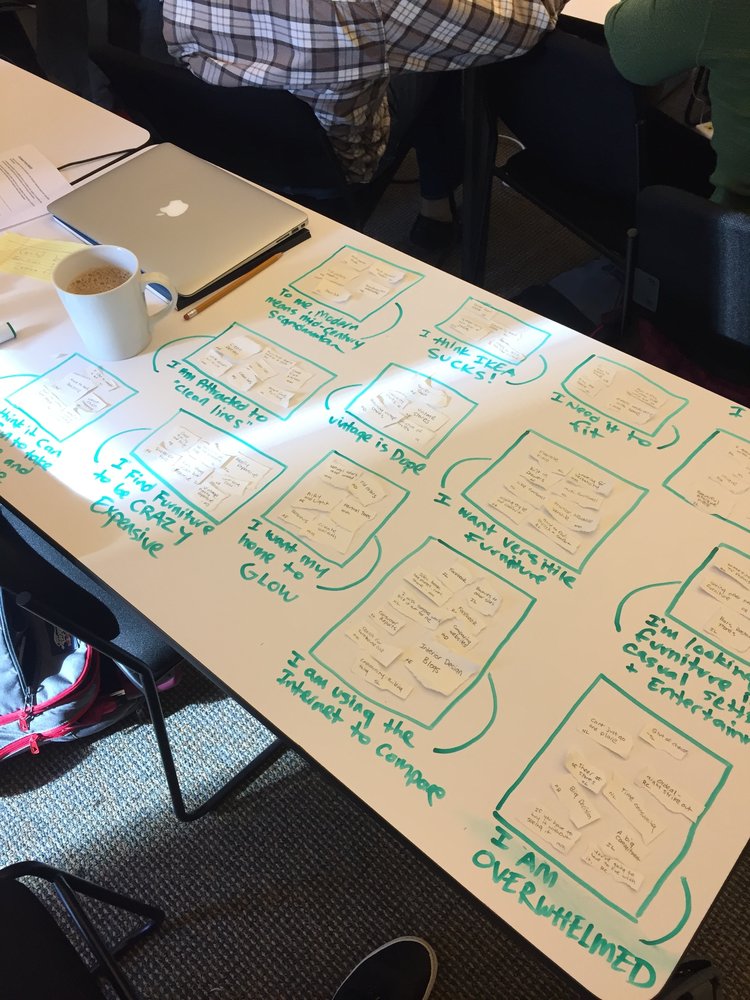
By affinity mapping responses from interviews, I was able to create Jenna, who matched the aggregate data. She’s not rich but she has a decent job and is ready to start putting together furniture that she wants to live with for a long time. The functionality of décor is still important to her, but now she’s thinking toward creating a home, which means cultivating a collection of objects that are imbued with a sense of nostalgia. She wants her home to glow the way it did when she was young and the furniture she grew up with informs her decisions.
Jenna is not opposed to purchasing small gifts online, especially with the holidays approaching, but with large purchases, such as a $1500 couch, she wants to see it in person, to touch it and judge its durability for herself. As she accustoms herself to the prospect of making a big purchase, she’s surfing around trying to find shops she wants to visit physically. Jenna wishes she had a really smart friend who could just make the decision for her. She dreads the idea of salespeople and is trying to convince herself that the exploratory, treasure hunt nature of furniture shopping will, in the end, be fun and surprising. Jenna wants to engage with real people.
4. Design Goals
Retrofit had to differentiate itself from Ikea. Much like the physical IKEA, the digital IKEA site has no face and isn’t populated by real people. The site itself, like the physical store, is overly crowded, forefronts its cheapness by highlighting recalls, and bombards the guest with a visual and informational blitzkrieg of boxes, buttons, and calls to action. The main hero scrolls through images packed with words but scrolls so fast that a user can’t read it fast enough and feels as though they are falling behind from the first moments on the page.
Secondly, I wanted to consciously design for surprise. Certainly, there will be times when Jenna is looking for a specific sort of end table and will mostly want to find an object that reflects her vision for this piece. But, on the whole, Jenna is trying to decide if this one of the shops she will physically visit. In order to entice her to make the trip, we need to try to replicate the pleasure of surprise that is present in a physical vintage shop.
5. Sitemap
Having worked at Gilt Groupe and One Kings Lane, site mapping fashion or decor inventory is relatively straightforward. At the physical store, I made a list of specific items and them card-sorted them into top nav categories.
If the map becomes too wide and shallow, the homepage will be too crowded with buttons and the user will be overwhelmed by options. If the map is too narrow and deep, there will be a small number of buttons on the homepage, but it will take a user too many clicks to reach their desired product. This is how I balanced those two needs: seven nav elements wide, three tiers deep to get to the product page.

6. Design Process
I started by quickly hand-sketching the wireframes of every competitor I could think of: OKL, Gilt, Ethan Allen, West Elm, IKEA, and others. Then I began by sketching product pages, one after another. In my extensive online retail experience, the product page is foundation of a site - even more important that cart fluidity. It's the place within the site where a user makes the most important decision - "yes or no?" I drew 30 or so and gradually, certain elements began to converge while others fell away. Eventually, I began higher def hand drawings.


After the product page felt solid, I began working backward from the "center out," making the category pages, and then the home page, cart, and the team pages. Once the wireframes had been drawn, I began to lay out the interactive wireframes using Axure, defining the properties and transition cases of each object. But it wasn't until this step that I was able to actually address the issue of surprise.


7. Surprise
This is a widespread paradox in design for online retail. The general goal of good Information Architecture (or Library Sciences) is to show a user exactly what they want. But this assumes that they know specifically what they want. To discover latent wants, Information Science builds algorithms to figure out how to "surprise us" with what we want but that's hard to apply to a platform like EBAY that has millions of unique items every day, let alone a local home decor shop like Retrofit.
Users said that one of their favorite things about shopping at vintage stores was being surprised. The interior of Retrofit's physical shop wasn't arranged like an IKEA, not with specific categories lined up according to perfect IA (Lighting, Carpets, Wall Decor, etc.). It was a marvelous hodgepodge, a treasure hunt. If a customer had something specific in mind, they'd have to hunt or ask a clerk. Not only did "scoring" in this surprising way offer a much bigger reward, it also offers the best way to differentiate a small local shop from a global behemoth.
I decided to lay the clean design (which differentiates Retrofit from IKEA's chaotic, overcrowded layout) over a series of objects that become opaque with a mouse-in hover. Those objects show a randomized series of every product in Retrofit's inventory. The product pictures underneath would be different every time the page is loaded. Users who hovered over one and looked at the product, would want to see what was hidden beneath the other boxes. Suddenly, they're hunting, discovering. And each product object bounces the user directly to the product page, facilitating the possibility of that "score" moment.
8. Features and Reasoning
Team Page
Aside from surprise, users wanted a more humanized and local environment than offered by IKEA. It's important to put real faces on the page, not models, but the actual people who own the place and who selects the merchandise (you can see bigger brands trying to do this already). Retrofit wins users by being human.
Quotations
Again, these are used to humanize the page but also to direct attention.
Cart Dropdown
A big part of successful online shopping is that the user develops a rhythm. If a user wants to see what they have in their cart, they shouldn't have to page out and then page back. It breaks up the rhythm. So a sort of super nav when a user hovers the cart icon instead of clicking.
Highlights Board
This is becoming common among online retailers and for good reason. It's meant to be a wishlist of things that won't necessarily find their way into the cart but could. It's almost a sort of mood board for users, similar to a watchlist on Netflix. Users told me that they used online shopping for window shopping before they went into the store. This is a tool for that activity.
Fun Photos (Product Galleries)
These both break up the visual monotony of the product galleries while again reminding users that Retrofit is not completely sterile, unique, local, and human.

9. Iterations
Category Indicator
To better fulfill the system status heuristic within the category galleries, I added a bar showing which part of the category a user was currently in. This provides better visibility into where a user is within each category and the site as a whole.
Highlight Popup
The heart icon is gaining traction but it isn't as obvious as the hamburger icon for menus or stars for ratings. This popup would only appear on the first hover and cookies would make sure wasn't there the next time.
Team Profiles & Picks
To further humanize the store, putting specific faces on the site that also exist in the store is so important. Users may actually become desensitized to algorithmic recommendations, whereas a recommendation from Ben or Amanda would actually break through.
10. Future Iterations
Return Policy
In future versions of this wireframe, the return policy would need to be much more heavily fore-fronted if the goal was to drive online sales rather than a tool to prepare for a brick-and-mortar visit. The more generous the return policy, the less risk assumed by the shopper to buy without touching the actual product.
Clearer Path to Team
Currently, the only way for a user to get into the team section is to click on one of the quotations or on the team picture but this isn't necessarily intuitive. The original idea was that it was supposed to be a bit of a secret, a knowing wink among locals. There are over a hundred links that lead to the page but, if it's worth having, it should be made more prominent.
More User Testing
The horizon for this project was so abbreviated that there wasn't enough time for robust user testing. Users could uncover far more positive design iterations that myself.
11. Conclusion
By laying an intuitive IA layer over a surprising randomization of products, this design helps Jenna find something specific if she already knows what she wants but it also approximates the the pleasurable treasure hunt of vintage shopping that she loves. By emphasizing local connections and the human personalities of its staff, this design helps Retrofit Home leverage its small size to differentiate itself from global chains and compete for Jenna's business.