SINCRO INVENTORY MANAGER
Project at a Glance:
Sincro Inventory Manager is a system by which everything about vehicle inventory, including photos, pricing, incentives, and specs is imported from from third-party vendor API and seamlessly exported through to customer-facing websites. Much of the outdated interface and functionality was being lost when Sincro was sold by CDK Global to Ansira Partners and had to be rebuilt from the ground-up. The old tool, Lot Merchandiser was only used by external customers at a 5% rate and the new product suite is utilized by 80% external users, migrating a vast amount of labor away from our internal support teams.
Project Summary:
SIM is a suite of 19 individual tools that was rebuilt from scratch as its own product vertical. The suite allowed clients from companies such as GM, BMW, Ford, Chevrolet, Jaguar, Infinity, Honda, Volkswagen, Land Rover, Nissan, and many others to populate their vehicle inventories accurately within their family of websites. This project took approximately 8 months and involved extensive external and internal user research, collaboration with Product Managers and Developers and Engineers, frequent iterative design within an Agile framework, user testing and User Acceptance Testing following soft launch and prior to wide release.
Tools:
This was an interesting project because, halfway through our team switched from a Sketch / InVision pairing to Adobe XD. Though I was familiar with XD from my freelancing days with Start Button, it required a ramping up and familiarizing with new layering, nested components, and states. The transition was relatively smooth and reminds me why designers should remain tool agnostic. I’ve been loving XD, which has improved significantly since I last used it extensively, though I still probably prefer Figma. Other tools used for this project include Craft, Miro, Material Design libraries, Confluence, Google Surveys, and One Drive.
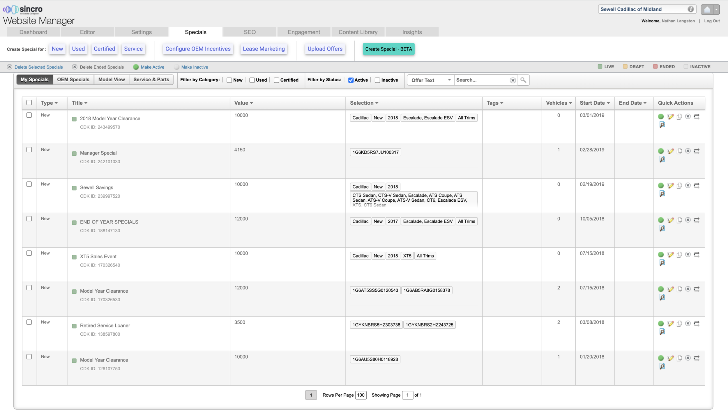
1.SIM Before and After:
These are individual examples of a few screens of the more than 400 page states from Sincro Inventory Manager (formerly called Lot Merchandiser) showing a before state and an after redesign state. After conducting user interviews and research, we found that most people wanted to see as much information as possible at any given time rather than the spaciousness often employed by many forward-facing E-commerce sites. Our research found a big difference between the usage of administration and configuration tools as opposed to best practices for shopper sites, primarily because these tools are meant to be used repeatedly every day. Certain improvements included, regrouping similar tasks and data, creating a variation of the Material design table component to allow users to compress their data when they chose, and a full Information Architecture revamp to improve intuitiveness and speed of navigation among tools to solve a variety of tasks.

Lot Merchandiser Dashboard before redesign.

Sincro Inventory Manager Dashboard after redesign.
Vehicle Incentives before redesign.

Vehicle Incentives after redesign.
2. Process
Showing before and after images is a good way to show the overall effects of including design thinking and the UX process in the product development cycle. But for designers, the question is “how does the sausage get made?” What are the actual steps taken to resolve design problems? This depends on the needs of the project but here’s how I tackled this particular case.
A. Design & Content Audit. If there’s some old UI that’s being abandoned, I start with a critique. I mercilessly rip every state of it to shreds. This could be done to any of my designs and, when presenting my findings, I always like to note that it’s easier to critique than it is to build something new. But aside from creating a punch list of specific problems that need to be addressed, this sort of close looking allows me to quickly ramp up on the current thinking of how the product is intended to function. It gives me an understanding of the problem space and a place to start.
B. User Research. In the case of this tool, 95% of usage was internal. This makes research far easier than trying to locate external users for a B2B SAAS product. A strong case is made to individual team managers who allocate the time. In this instance, I performed 17 interviews lasting about 30 minutes each. These were video meetings and I recorded them so as to watch how users actually moved through the interface will trying to solve problems. Analysis exercises like affinity diagrams and card sorting were performed to identify clear design rubrics and information architecture. Included in this work was a quantitative survey I created and mounted on the product itself for both internal and external users. These metrics were utilized whenever we (Design / Dev / PM teams) were uncertain what decisions to make.
C. Mocks. From outside of UX, the other disciplines often only see this and think it’s the only thing UX does. When there are open questions, I like to think of UX as being an opportunity for providing options for the team. Here, I’m trying to offer options for trying to tackle navigation problems with the product. This brief walk-through led to a full redesign and build of our company’s global navigation system. Each problem set requires different types of mocks. Sometimes PMs and Devs just need static pages to understand build requirements. If we’re addressing interaction, a fully animated prototype using design system components is needed.
D. Iterations. The first option is sometimes the best, though rarely. If it’s a large and long-term project, I start with hand drawn sketches and set myself a goal of 10 or 20 iterations of each page state. By drawing quickly over and over, I explore as many options as cheaply as possible. It’s fun and generally my thinking coalesces toward the end as I begin to draw pretty much the same thing many times. Further iterations happen as I present to the team. For this project, I received simultaneous feedback from PMs and Devs. In general, I’ve found that PMs want to know how they’ll sell it and Devs want to know how they’ll build the functionality. Both perspectives are valid and insight from both disciplines is important. It’s also important to know when and where to pick battles when it comes to usability. I’ve found that when I show respect and deep understanding to both of their jobs and have shown how I can make their jobs easier, I have more authority when I really kick up a fuss about a particular user pain-point. This particular project was being designed at the same time it was being built, putting me fully within the Agile/Scrum process on a daily basis. Not ideal but we made it work and new design iterations got assigned into each sprint.
E. Testing. Due to the high-intensity work of our users, it’s often hard to find dealers to participate in user testing. Instead, as 95% of the usage was internal, we conducted user tests with internal staff, both on the highly technical side (Tier 3 support staff and API coders) as well as customer facing staff (Tier 1 support staff) to chart their user flows. I created a usable prototype in XD and interview script and had users walk through 6 goal-oriented tasks. These were conducted by a third-party designer so as to avoid bias. Our success rates were almost 100% but there were certainly comments and questions from subjects that led to minor alterations in the design.
F. Build. During hand-off to devs, we focused on functional problems and made sure that we were using the same elements from the design system. One of the most difficult conversations with devs continues to be around responsive behavior and how the designs should adjust as resolution of the browser window is changed. In order to solve this, I created mocks of certain key page states in various device resolutions, as well as creating a grid-framing system that we could use in order to communicate about internal and external object behaviors. This framing system has now been taught to all of our designers and is being used in every design/dev hand-off. I also continued to sit in on every demo session to make sure that the code aligned with what had been envisioned and tested.
3. Challenges
One challenge of this design initiative that was trying to design a cohesive suite of tools that were owned by three different Product Managers. I’m fairly used to this from my experience working as a single designer under 9 Product Managers at Microsoft. I was also lucky in that, by and large, the Product Managers working on various aspects of SIM had mostly aligned visions. Where there were difference of opinion, we employed user data, actual customer feedback, and crowd sourcing among a host of stakeholders to make informed decisions with good humor and collaboration. The result was a suite of tools that feel as though they belong together like a family, rather than causing users friction as they move from place to place within the suite in which case they would have needed to relearn usage and remember IA.
A second challenge was moving goalposts. This wasn’t exactly a form of scope-creep but more due to a hard and pressing deadline for finishing the tool. This meant that much of the suite was being built concurrently to design. While not necessarily ideal, I achieved success by remaining in rhythm with the dev sprints, attending demos so that we could correct design issues in real-time, as well as adding new design fixes into the roadmap when proposed functionality proved to be impeded or two expensive. The cadence and partnership relationships I developed with our Engineers and Developers went a long way. The more I understood about their coding process, the more I could tailor my designs and interactions to their individual needs and preferences.

SIM Support Tool before redesign.

SIM Support Tool after redesign.
4. Product Launch
The Sincro Inventory Manager suite was released as its own product vertical to the public in July of 2021. There are still numerous major initiatives to improve usage going forward but the new interface and architecture was hailed as a game-changer by both internal staff and external customers. One of the biggest metrics of success was seeing that, with the new suite, 90% of the usage has been by external customers rather than our internal staff, which had been handling nearly 100% of inventory population issues previously. At one of the first presentations of the new UI to internal staff, one support member was actually in tears because we had actually listened to how they work, what they do, what they need and they felt seen by our company for the first time. SUS score improvements and User Acceptance Testing has been at the very highest end of the scale. If SIM continues to perform and improve at this rate, this new product may well provide a key differentiator with competitors and represent a pillar of Sincro’s offerings.