Walt Disney and Leonardo Da Vinci

Whatever you think about Walt Disney, he and his team of animators were visual geniuses. For someone that made his money drawing a cartoon mouse, he was deeply invested in injecting physics into his animations. Here’s a list of animation principles developed by the animation team at Disney (rad GIFs as well). The physics made the cartoons more real and the gags more funny. Bending the rules of physics made the cartoons more cartoonish and magical.

Here’s the man himself showing off their cutting edge animation tech in 1957, called a MultiPlane Camera. It’s basically a way to achieve parallax scrolling (which I discuss in a prior post) without computers. It’s a camera and a bunch of moveable planes with various, moveable images laid on different panes. Look how many people it takes to run it! Plus, it adds an element of live performance to the animation which is remarkable.

One thing: I can’t tell whether this machine achieves what Leonard Da Vinci called “Aerial Perspective” or “Atmospheric Perspective.” It was one of those “obvious in retrospect” visual effects. Things at a great distance have more air particulates between the object and the eyes. Thus they look blurrier, their colors grow more muted and cooler. So if you were zooming out, the moon and the village in the background should become blurrier and more muted. The camera might be able to actually pull a plane back away from the camera (or the camera away from the planes) but not enough to achieve this effect. You’d have to re-paint every plane as the camera zoomed out.

Check out the difference in color and resolution of each layer of hills.

Check out the difference in color and resolution of each layer of hills.

Though with computers, I’m sure Pixar has this effect dialed in (62 years later). For me, I’m thinking about how to make effects in Figma to apply, not only to the elements that pop forward (drop shadow, etc.) but that mute and cool the planes behind so that they drop away. Hmm. I think I’m going to go play with that right now.

Nathan Langston
Visual Mapping

Yes, I have a crush on NASA and, yes, I believe the Mars rover Opportunity was one of the most remarkable human projects. But this map! This map by the New York Times. Everything about it. The way the down scroll moves both vertically and horizontally to follow the path of the rover. The way the dates are lined up next to the path. The labeling on top of actual photos of the surface of another planet. The images taken by the rover that popup at locations along path.

This is just stunning visual story-telling. Over the past few years, the NYTimes has put out a number of visuals like this, and, especially when translating big data stories, they are publishing some truly eye-popping design.

When UX designers overuse the word “delight,” this is what they mean.


Nathan Langston
Just Pics of Olafur Eliasson Works

This dude continues to create deeply satisfying optic effects.

“The Weather Project” at the Tate Modern.

“The Weather Project” at the Tate Modern.

“Your Rainbow Panorama” at ARoS Aarhus Kunstmuseum

“Your Rainbow Panorama” at ARoS Aarhus Kunstmuseum

Various works at Tanya Bonakdar Gallery

Various works at Tanya Bonakdar Gallery

Nathan Langston
I WON A HACKATHON
Hackathon.jpg

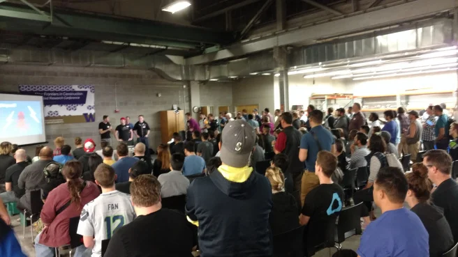
I took part in my first hackathon, one that was hosted by General Assembly and Socrata. We had 2 UX designers, 2 data science guys and, 2 UX designers. The goal was to create an actual application or a functional site that performed a public service for the city of Seattle. 

By the way, Socrata is a baller organization. That's not just lip service. They help local governments and communities compile large sets of data and format all that data so that it's openly available to any developer that wants to take a crack at doing something with it. So they've got data on healthcare, on street signs, on number of evictions, on pretty much everything from the departments of a city. And the city pays Socrata to compile it in an easily importable and searchable format. In turn, Socrata charges nothing to developers, with the hope that they'll turn all those data sets into some sort of a civic game changer. 

I don't know if there's any money in that model, but if there is, it's just about the best way to make money of which I've ever heard.

After an hour snow delay, we had to build this thing in five hours. The first 30 or 40 minutes was spent haggling about the nature of the site. Basically, we knew we had to use some of Socrata's data but didn't have a great understanding of everything contained therein.

So we thought, 1) We could make a topographical map that allows bicyclists to find the flattest (or steepest) routes. 2) We could find city complaints against landlords to find the most vulnerable pockets of folks in Seattle. 3) We wondered about mapping food deserts. 4) We thought about using parking data to make an app that displays open parking garages. 5) We pondered doing a real estate app but figured that it would make for much of a social good. 

So we settled on creating a website that calculated the number of car accidents that happened in any given intersection in Seattle. We called it "Sketchy-section." 

The weird thing was that, from a UX perspective, the whole process seemed backward. We looked through the datasets and found one that was robust enough with which to work. Then we figured out who the users of that information would be and how to present that information to them. Then we figured out what the user's problem would be. So, unlike the standard UX process, we only had enough time to start with the solution and work our way back to the problem. 

Agile process is so fast that I imagine this to often be the case. The rapidity and volume of agile is both its great strength and its weakness. Actually, artists also cheat this same way all the time. An artist is told (over and over) that the process and the story of their art is what is most important by that same artist is shown (over and over) that was is most important and valuable is the finished product. So usually what happens is this: An artist turns off their brains, whips out some wilding splash of human originality, and then, retroactively, figures out how to explain what they were thinking, phrasing it as though they had been high-mindedly philosophizing the whole time. 

Oh, and even though I'm overthinking it, we won. Our team won the hackathon. Thought I should just slip that in there. We killed it. 

We found a juicy dataset, which was traffic collisions in Seattle. We found that accidents are reported to the city via closest intersection, the cross streets of which could be mapped (and even heat mapped) to specific intersections. The idea was that, if you thought there was a sketchy intersection in your neighborhood, you could type in the cross streets and see the actual statistics of accidents there. That seems like a pretty straightforward piece of information that should be available to citizens but that data is almost impossible to find.

Originally, we wanted to compare accidents to locations of stoplights to see if we could find spots where a ton of accidents were happening that didn't have signage but should. That didn't really work out. The data wasn't super clean and we found out that we couldn't access some of it more than 2000 times in one go without paying a fee. Ultimately the Data Science guys wrestled with the set for four hours or so and ultimately found a corollary, but not one that made for a good story or application. Which is one of the problems of data science. It takes a lot of work sometimes to test a theory, to scrub a dataset, and after a ton of math and programming, the answer is "there's nothing compelling here." Which is a perfectly valid and acceptable result of an experiment. It just doesn't work well in an agile sprint or hackathon. 

So we were left without a second vector to compare to. We just had a big list of the locations of car crashes. The development guys sweated for hours on how to translate that set of coordinates onto a Google map. It took forever and, in the meantime, us UX designers were left sitting around. Eventually, we decided to start working as though the project had already been completed. Ramon, the other UX fellow is flabbergastingly good with visual design, so I started him on designing the assets for the very simplistic page, as well as for the powerpoint presentation.

I went around, surveying everyone in the room about something I already knew was true. I asked them if 1) they knew of a sketchy intersection, 2) if they actually knew how many accidents had happened in that supposedly sketchy intersection and, 3) where they would try to find that info if they needed it. The predictable answers proved true. Everyone knew of a dangerous intersection, no one actually knew how dangerous it was, and no one had any idea how to find that information other than a Google search, which was fruitless. So even though we couldn't compare a second dataset to a first, just by laying it on Google Maps, we were created a fairly basic service that the City of Seattle had never provided. In less than five hours. 

Okay. Actually, that's pretty neat. Click the image to check out Socrata. 

Nathan Langston
Just Pics of Sarah Sze Works

Sarah Sze is the best. Her abstract sculptures are made out of recognizable things like ladders, measuring tape, electrical cords, birdcages, desk lamps, and so on. At first, I thought her work might be gimmicky but no. The more I stare at these the more my imagination just starts humming, shooting off in a bunch of directions.

“Equal and Opposite Reaction” at McCaw Hall in Seattle.

“Equal and Opposite Reaction” at McCaw Hall in Seattle.

“Second Means of Egress” which comes in various versions in Cambridge, MA, Washington, DC and London.

“Second Means of Egress” which comes in various versions in Cambridge, MA, Washington, DC and London.

“Portable Planetarium,” currently at Boston Museum of Arts.

“Portable Planetarium,” currently at Boston Museum of Arts.

Nathan Langston
Algorithms vs. Gut Response

Perhaps it’s only peripherally related to design but this article about baseball statistics blew my mind. I don’t even like baseball much but this is about how analytical statistics and algorithms are often pitted against gut response and instinct and a “cultivated judgement.” At work, I think of this a lot in terms of the machine learning and data modeling done by my team at Microsoft. At home, I think about how Google and Facebook and Netflix use algorithms to craft the media I’m presented. As a musician, I think a lot about the Spotify backend using implicit matrix factorization to suggest I listen to the Pixies.

So basically, the math and probability nerds creating scoring systems and playing “Moneyball” versus the wise and grizzled old baseball scouts chomping cigars at a minor league game, looking for the next superstar. Or the AI engineers vs. the film connoisseur. Or Spotify’s Python libraries versus the cool DJ who can compose the perfect mix tape, just for you.

What’s amazing about this article is that it argues that the distinction between those two strategies is often a false dichotomy. Even when designing algorithms to sort big data, there’s still opinions and judgement at play about what data and what scoring is actually important. Does it matter how far a batter hits the ball? Does it matter more that they get on base? Does it matter how they play at night versus during the day? Despite the ability tech has to compile vast amounts of data and measure correlations, it’s still a judgement call about what correlations matter most.

For some reason, I find this deeply comforting, that often at the root of the most powerful aggregation programs is a judgement call, and human opinion, an educated guess.

Nathan Langston
NASA Design Manual

In what was almost certainly one of the most romanic design gigs of all time, Richard Danne and Bruce Blackburn got to compose the NASA Graphics Standards Manual. These guys were doing design that wound up on Space Shuttles, astronaut shoulder patches, super sonic jets, and satellites. 

Layout.jpg
Nasa logo.jpg
Shuttle.jpg

Their extremely tiny firm determined the design style of space exploration until 1992, when NASA switched to the super ugly "meatball" logo. Still, this careful, powerful manual is such a statement!

Nathan Langston
John Coltrane was a Physicist

Music is the aesthetics of mathematics as it relates to the physiology of the human brain. A mournful song is mathematically resonant as sad based on the circuitry of the brain. Certainly some of it sociological, based on our cultural context. But, as eloquently argued in "This is Your Brain on Music: The Science of a Human Obsession" by Daniel J. Levitin, it's also a neurologically structural effect. In this way, musicians are just playing with the brain effects of sound.  It makes perfect sense to me that John Coltrane was well aware of Einstein's work and spoke of him often. 

A sketch of the circle of fifths by John Coltrane

A sketch of the circle of fifths by John Coltrane

Nathan Langston
An Embroidery of Voids

When I first saw this video by artist Daniel Crooks (commissioned by the National Gallery of Victoria, Melbourne), I honestly didn't get it at first. I thought it was just really janky CGI. But it's not. It's real life video that was filmed in actual alleyways and then chunked into boxy pieces and stitched together as though it was just one, long, unending tunnel. This video mosaic requires (I'm assuming) 1. Finding similarly sized alleys otherwise the walls would move at different speeds in different segments. 2. Moving the camera smoothly and as straight as possible. 3. Creating digital demarcators to know how far to let a video run before pasting in the next clip. What I wonder is how far in he zoomed, meaning, how many clips or segments actually exist at any given time? 

Click this image to watch and you'll get pulled in. Make sure to use headphones because the soundscape by Bryon Scullins creates so much drama, especially when the camera goes off track (which feels like Inception or something). 

A UX buddy, Alicia Shupe, saw this and forwarded me a video by Bonobo called No Reason (Feat. Nick Murphy). It features almost exactly the same technique. It's a dark video but once you start, you won't really be able to stop watching. Click to watch: 

Nathan Langston
Paul Klee
Pages from Paul Klee’s notes. Images via Zentrum Paul Klee.

Pages from Paul Klee’s notes. Images via Zentrum Paul Klee.

"How To Be An Artist, According to Paul Klee," is such a simple, beautifully insightful essay by Sarah Gottesman for Artsy. I had always loved Klee's works whenever I saw them, and I knew some sketchy details about his work at the Bauhaus. But this little article makes me wish terribly that I had gotten the chance to know him. 

For example, he took a color wheel and made it into a color sphere, with white at the top and black at the bottom of the sphere, to model all elements of color, including saturation, hue and value. He also thinks that color pairings worked like music and could make harmonious or inharmonious sounds. I totally thought this once when I saw a room full of Rothkos and they seemed like they were humming at me. Plus, Klee also played the violin. 

So many mind blowing things in this essay. Like how the father of abstraction could have been so devoted to natural branching systems like trees and plants or the circulatory system. Or that the first line of his Pedagogical Sketchbook was: "An active line on a walk, moving freely, without goal." 

Left: Paul Klee’s color chart, from his notes. Image via Zentrum Paul Klee; Right: Goethe’s color wheel, published in Theory of Colours. Image via Wikimedia Commons.

Left: Paul Klee’s color chart, from his notes. Image via Zentrum Paul Klee; Right: Goethe’s color wheel, published in Theory of Colours. Image via Wikimedia Commons.

Nathan Langston
Bodies in Motion

Coming from an accidental dance background, I now love dance as much as I love football. I never played football but my dad and I watched on Saturday and Sunday and talked strategy and, like it does for so many dudes, it became bit of a secret conduit language. I didn't grow up with dance, and if you didn't grow up with dance, chances are you aren't into it. That's because, irrespective of its intentions, dance has sequestered itself.

Luckily, I am too stupid to appreciate the pedigree of dance and it can come live down here with football and the rest of us. And, in return, the rest of us can be lifted up, breathless and alight above the stage. For example. Click on La La La Human Steps to be staggered. 

This is not to discount NYCB or the likes of Justin Peck and his gang of highbrow cool kids, or the high-minded tear jerker they pulled off with Edward Sharpe. Click to cry. 

But I have to say, I still have a bedeviled and rebellious moxie in me that hopes there will never be a written notation that perfectly captures dance. Even if someone did figure it out, they would need to notate the gyrations of the wrist, neck, hip, knee, ankle, toe, elbow, eye, and each and every finger of each and every dancer. Maybe motion capture will solve for documentation. But until then, we'll just have to believe that what Storyboard P does in a hotel hallway is actual magic. Click and learn. 

Nathan Langston
Bowie

It's truly difficult to understand how this video was filmed in 1973. Click the image to listen. 

Nathan Langston
Parallax and Multi-Directional Comics

I'm not a huge fan of flat minimalism as broadly applied to design. It's everywhere. I often walk into coffee shops that look like the Apple store, which in turn look like a flat website, which essentially resemble a piece of white paper. I get the appeal. I understand the cleanly spaciousness of white box galleries. If I wanted to, I could eloquently argue in favor of including minimalism as one of Neilson's design heuristics. Actually, let me do that now. 

Minimalism is an ideal mate of User Experience design. Strip a site (or any tool) of as many elements as possible until is offers only the most essential interactions. In general, when people interact with the internet, they feel assaulted by an infinite barrage of information. It's overwhelming and uncomfortable. The amount of information and options and decisions put before us make users feel as though they're falling behind even before they've done anything. You aren't keeping up with the world in which you live, and how could you? What puts us at ease is a single image on a screen, or a single sentence, or blank piece of white paper with a single paragraph printed upon it. In many ways, flat minimalism gives us exactly what we want. 

But this is not universally true. For example, look at the aesthetic of the Barnes Museum. Or the maximalism of Karl Lagerfeld’s library in Paris: 

It's an open question to me as to whether user experience design is necessarily didactic and reductive or whether it can present an infinity of information to users in a useful manner. My equivalent would be that it overwhelms me to look up at the stars when I'm in the San Juan Islands because it makes me feel incredibly small but that that experience is informative and helpful to me as a human. 

One step to addressing this design concern would be to "unflatten" web design. Parallax scrolling is good for this and I first remember it being employed with Mario Brothers, to make the mountains and clouds seem distant from the fast moving foreground. Even two parallax layers give a sense of depth but what about five? What about 50 layers? How many layers would it take (like frames a second) to fool human perception into feeling real time dimensions? Great examples include the FireWatch site, which includes 8 or more layers of parallax, and the Seattle Space Needle site, which starts at the bottom and scrolls upward, the opposite of almost every site, and ascends (appropriately) all the way into space. 

Well, this doesn't get quite there but it is such a mind blowing way to show a comic book. Scrolling from left to right, the web comic Hobo Lobo of Hamelin usually employs at least four layers but sometimes more. Click this image and start scrolling through and you'll get a taste of what a website with depth can offer. 

Another thing I think about often is that pages don't necessarily need to swipe down or automatically to the right. These are based on our assumptions of what it's like to read a book (in English) and means our online experience is often tethered to the limitations of reading a book. That's how most website work. But what if the pages were a 360 degree carousel, in which there were different options offered based on the direction you were "facing?"

An amazing online comic that plays with this concept is called Failing Sky. From a UX perspective, it's not easy or intuitive. The comic often asks you to break your preconceived notions of how to move through a website. Sometimes you have to scroll left or scroll up or you hit a dead end and have to scroll back only to discover that it's not the same image you scrolled away from. Usually, the author tricks you on purpose, knowing that you'll naturally want to scroll down or naturally scroll right. It makes UI seem like a video game and the experience of the images and story is richer for it. Click on the image to start the multi-directional story-telling. 

Nathan Langston
The Sound of Wikipedia

This is one of my favorites. Stephen LaPorte and Mahmoud Hashemi at Hatnote built a site called Listen to Wikipedia. Built with D3, HowlerJS, and based on BitListen, this uses bots to find new edits to Wikipedia and assign those edits sounds, based on different parameters. For example, pitch of a note is based on the size of the edit. If it's a big edit, it's a deep note and if it's small, it's the highest key on the piano keyboard. Visually, green circles are from unregistered users, purple denotes bot edits, and there's a swell of strings when someone new makes their first edit. 

One of our instructors at General Assembly mentioned that we should avoid using sound in site design. For the most part, I agree with this. It can seem intrusive if a site starts making sounds at you, especially without your permission. I've been to a few restaurant websites that have started playing awful music at me and I shouted Shut Up, which generally does not indicate a good user experience. Still, cutting sound out entirely seems to remove a very large way in which we as humans express and receive information. 

Some musicians wouldn't consider the sounds made by this site to be "music." But I bet John Cage would be utterly enraptured. Click the image to look and listen. 

Nathan Langston
Fun with Mouse Location

One of the things I'm currently geeking out on is creative ways to use the mouse locator. Warby Parker is actually one of my favorite e-commerce sites - spectacular UX experience, which makes sense, as they have no physical storefronts.

Designed by a badass firm out of New York called High Tide, they've always played around with interesting ways to display product. For example, they used to allow users to take a picture of themselves and then place images of glasses on their photo. Now, every pair of glasses they've got, they take 7 pictures of the model looking in different directions, from left to right. Depending on where your mouse is located, a different image is displayed, allowing users to move the model's head back and forth. It's actually a pretty simple CSS process and doesn't overload their Production Team with a crazy amount of work. 

But you should see users on this site. Everyone loves making the model shake their heads. It's pleasurable, kind of funny, and really displays the product well. It really makes you want to keep doing the trick on a number of products. Pretty dope. Also, I kind of have a crush on their massive product hero image at the top. Check it out here: 

Another trickier, more robust, and totally purposeless site that employs this creatively is Pointer Pointer. All you do is click your mouse somewhere in the field and you get a picture of someone pointing right at where your mouse is on the screen. It's just for fun and is supremely enjoyable but what's going on behind the scenes is kind of tricky.

They have different sets of photos each time you log on, and each image is named 258_683 or 199_321 or something, denoting the X and Y axis of that photo's "point." This means that they have to tag these individual images by hand, which entails a huge amount of work for such a pointless, ticklish experiment. 

They also cheat a bit. There's generally only ("only") 90 - 100 images loaded each time you log on. Each image only has one "true" pointing coordinate, so they mess with the image padding to move picture with the closest XY coordinate so that the person in the picture is pointing right at your mouse. That's a tricky little piece of CSS math that is beyond me but it definitely makes the site seem more magical. That's amount of work for something so trivial rivals even reshooting Star Wars in ASCI characters. Good job nerds. You done good. Click on the image to see it in action. 

Nathan Langston
One-Up Game

In ancient greek, the word Ludus had several meanings. It meant both game and school, both play and learning. It also meant a poetic play. It also meant a place where gladiators murdered each other for sport. It's the same with the word "game." There's a bounty of meanings secreted away in the manifolds of that one word. 

Of all of my favorite projects at General Assembly, my favorite was creating the One-Up Game, a project which had nothing to do with the curriculum. Good games have few rules. This is almost always true. It is a bad sign that American Football has a rulebook that looks like a Bible. It's probably a better prognosis that European Football has a rule book that looks like a pamphlet. Cleanliness and simplicity lead to durability. Tic-tac-toe and Rock-Paper-Scissors will last longer than the works of Shakespeare because of its simplicity. One-Up had (I think) only one rule. Here's how it worked. 

One person played their favorite video on YouTube (or Vimeo or whatever). The next person would play a video that they believed to be cooler. Each successive player had to one-up the person that came before them. That's it! That's all the rules! 

So many things. The first is that the quality of content generated was kind of astonishing. It proves to me that algorithmic aggregators still can't hold a candle to room full of smart, funny, inspired people. Second, we often don't personally confront the enormity of the internet. It's presented to us in bite sized, searchable amounts of information. But if you want to win this game, you have to go to the end of the block, keep walking until you get out of the city, and go find the coolest video out there in the wilderness. It's kind of thrilling.

Third! We didn't really enforce any rules. We only implied that there might be rules. Not only did players follow them, they actually started inventing and enforcing their own. Like that a video had to be thematically associated with the video that preceded it. Or a video couldn't run past four minutes. People would come to me asking what the rules where and I told them to ask someone else because I didn't know!

In fact, this game was spectacularly difficult. It was mostly pointless, mostly just for laughs but it was astonishing the extent to which players wracked their memories for the very coolest videos ever created. It made karaoke look quaint. Actually, karaoke has always looked quaint and I love it still.  I will say this in honesty: If this game was played once a week, I would probably go to see the playing of it for the rest of my life. That's a fairly decent complement to pay a game we made up while drinking beer after design class. 

You can see some of the One-Up Videos by clicking on the image below. 

Nathan Langston