Visual Mapping
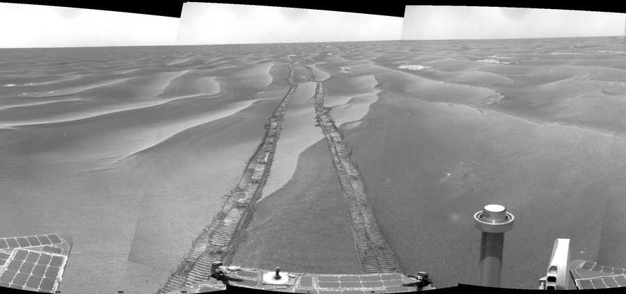
Yes, I have a crush on NASA and, yes, I believe the Mars rover Opportunity was one of the most remarkable human projects. But this map! This map by the New York Times. Everything about it. The way the down scroll moves both vertically and horizontally to follow the path of the rover. The way the dates are lined up next to the path. The labeling on top of actual photos of the surface of another planet. The images taken by the rover that popup at locations along path.
This is just stunning visual story-telling. Over the past few years, the NYTimes has put out a number of visuals like this, and, especially when translating big data stories, they are publishing some truly eye-popping design.
When UX designers overuse the word “delight,” this is what they mean.

